"'I’m like the blue rose.’ She smiles, then dies… then disappears before their eyes.” Such is the fate of the tulpa 1 after which the FBI’s Blue Rose Task Force is named in Twin Peaks: The Return (Showtime 2017), as Special Agent Albert Rosenfield (Miguel Ferrer) tells Agent Tamara (‘Tammy’) Preston (Chrysta Bell) when she joins in on the mystery. The blue rose, an unnatural occurrence, features as a poignant metaphor in this narrative world. Those familiar with David Lynch’s work may recognise it from the brooch and early reference to the object in Twin Peaks: Fire Walk With Me (1992), but much overlooked is the prominent role of the blue rose in his 2010 fashion film Lady Blue Shanghai. I use the term ‘fashion film’ as defined by Nikola Mijovic as “the short films commissioned by fashion companies as part of their online branding and marketing” (2013: 176). Conforming to the unjust stigma on fashion as being a frivolous, feminine interest and merely a product of capitalism (Church Gibson 1998), Lynch’s fashion film, made for and presented by Dior, has received markedly less attention in criticism than his other work. This article looks back at this 16-minute film after the release of The Return to show that Lady Blue Shanghai is a classic Lynch work in the way it consciously operates as ‘art’ as well as ‘cult’ (by an ‘auteur’ filmmaker) whilst being popular and commercial. I will argue that the way symbolism and tone are used in these texts, exemplified by the blue rose and other aspects of mise-en-scène, creates a conflicted viewing mode by both presenting a narrative riddle and defying serious interpretation.
Lady Blue Shanghai (2010), David Lynch for Dior.
In Lady Blue Shanghai, a blue Dior handbag magically emerges to motivate a dreamlike narrative unfolding around the arrival of Marion Cotillard as a foreigner in Shanghai. Although it is a fashion commercial, the style of the film—from the use of diegetic and non-diegetic music to the production design, framing, composition and camera movements—reads as quintessentially ‘Lynchian’.2 It is not immediately clear what it tries to sell – is Cotillard’s costume for sale; are we supposed to want to buy the eerily glowing handbag; or does the film promote the Dior—or Lynch?—brand more generally? John Berra writes that whilst filmmaker David Lynch and fashion house Dior “would seem to make for strange bedfellows” (2012: 234), the film exists as a successful convergence. Jess Berry more negatively claims that this fashion film “fails to obscure its commercial imperative” (2013: 2). Berra, too, states that the voice of the Dior brand remains dominant. I would suggest however that, in line with Lynch’s other tie-ins with advertising, product placement is implemented in a way that is acutely self-aware of its commercialism. My aim is rather to argue that the tone of the text undermines genuine meaning-making and creates space for an ironic reading and a critique on the nature of this type of advertising. It ridicules the trick of fashion films to display a product but package it in an ‘artistic’ way to cover up its commercial endeavours. This article further adds a fresh perspective to the abundant writing on Lynch’s work which tends to over-interpret and take too seriously his use of symbolism in an attempt to deal with the anxiety of not being able to fully make sense of it. I assert that interpretation can only get us so far but that a focus on tone can help us to better understand the complex workings of Lynch’s texts.
Playing with product placement
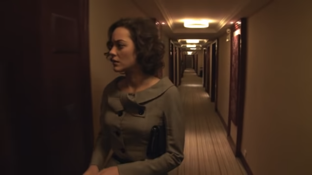
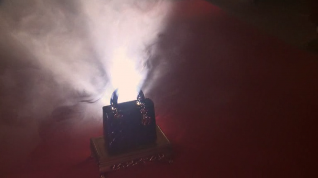
For Lady Blue Shanghai, Dior granted David Lynch creative freedom on the condition that the film would feature the Lady Dior bag, the Pearl Tower and the streets of old Shanghai (Berra 2012). The film opens with establishing shots of the Shanghai skyline by night and the hotel where Marion Cotillard’s nameless character is staying. As she enters the lobby, we hear the sound of her clacking heels over a soundtrack best described as ‘eerie’ (by Inland Empire’s sound mixer Dean Hurley) clearly announcing the atmosphere. Intercut with shots of the hotel receptionist, a tracking shot follows Cotillard as she takes a lift, ominously illuminated by blue light, and walks through the hallway. So far, the shots of Cotillard in a grey two-piece costume and a close-up of the back of her black stilettos can be seen as potentially relevant to the brand Dior. It soon becomes clear, however, that the item Lynch had to advertise is less subtly shown. As Cotillard crosses the hallway, diegetic 1920s-style tango music takes over the soundtrack. She opens door 815, bewildered to find the lights and the record player turned on. When she turns off the record player, the eerie music sets back in. Then a flash of lightning hits, and as she looks behind her, her startled expression is shown in close-up before we take her viewpoint to see the haze from which the Lady Dior bag appears (Fig. 1). The dynamic haze surrounding the bag is so intensely backlit that it illuminates Cotillard’s face and a black button on her jacket. To even greater dramatic effect, the camera closes in on the handbag, which is placed on a gold-coloured altar on the red hotel room carpet. This and later scenes foreground the advertised object with an exaggerated intensity that can be read as ironic, or at least as excessively aware of its function as a commercial. There is little evidence to assume that Lynch made any attempt to, as Berry (2013) puts it, obscure the film’s commercial imperative.
Fig. 1. The Lady Dior bag is shown from Cotillard’s point of view.
Over the past decades, Lynch has written and directed various commercials for fashion brands like Calvin Klein, Giorgio Armani, Yves Saint Laurent, Jil Sander and Adidas, and some of his film and television fiction includes product placements. The presentation of products in these advertisements is exuberant and over-the-top – exhibiting them with an intensity that verges on ridicule, but still promotes the brand. Whilst the objective to sell products is explicit in this merging of the Lynch with the fashion brands, there is an implicit criticism of commercialism packaged within the tone of the filmic material. As Douglas Pye (2007) points out, tone is a complex and slippery element in film that is subject to ambiguity and reliant on the viewer’s particular interpretation. Tone concerns not simply the unpacking of what is being signified, but “the ways in which the film addresses its spectator and implicitly invites us to understand its attitude to its material and the stylistic register it employs” (Pye 2007: 7). The attitude of Lynch’s advertisements towards their material, I suggest, carries a critique on the nature of marketing and the filmmaker’s role within it.
Leave it to Lynch to work with a fragrance called ‘Obsession’: his 1988 series of black-and-white advertisements for Calvin Klein are exhaustively melodramatic in the way quotes from F. Scott Fitzgerald, Ernest Hemingway and D.H. Lawrence are uttered by a sultry male voice-over accompanying overlaid close-up shots of people sensually touching each other.3 Monochrome cross-fading images also define ‘Who is Giò?’ (1992), a perfume advertisement for which Giorgio Armani phoned Lynch himself and prompted him to write what Lynch calls “almost like a little poem” (Rodley 1997: 211). The lavish commercial has an ostensibly genuine tone, but features a brief shot of a man sliding into the frame in pirouette with one arm raised, clipping his fingers, and disappearing into thin air. Are we supposed to take this advertising seriously? The same question can be asked of Lynch’s commercial for the Yves Saint Laurent fragrance ‘Opium’ (1992), in which a woman seems to experience the full effects of the drug opium when inhaling the perfume. Although comedy and satire are common in promotional material, these commercials have a tone that does not take the brand nor its consumers seriously.
As part of this mocking tone, the symbols used within the images are implied to be overrated. Lynch’s 1993 commercial for Jil Sander’s ‘Background’ perfume, ‘The Instinct of Life’, starts with a shot of waving curtains next to which a man is sat with a candle, which is then shown in close-up. The non-diegetic music sounds genuinely immersive, but then a close-up shows the man’s hand on the keys of a piano playing dissonant tones which sound like a child’s play. In the next shot, the candle is blown out with an exaggerated amount of smoke. Then a black panther jumps across the frame, and with the sound of lightning, the protagonist is shown in the corner of the frame, shot from the perspective of behind the piano and in front of bars, in black silhouette against neon green, hazy backlight. There he is, alone with a bottle of perfume, which is then, of course, shown in close-up. The perfume has apparently given him confidence to fight danger (with the black panther now growling and chasing him), as the man braves the space filled with—like many of Lynch’s advertisements—waving curtains, neon lighting, wind, lightning and haze. As the bottle of perfume tilts off its altar, the man’s hand catches it. The propulsive music supports this adventure. Tone, as Pye (2007) emphasises, is difficult to pin down, but it seems to me that these symbols are not invested with genuine meaning but are stacked in a way that undermines serious meaning-making despite seeming like a narrative riddle and that implicitly exposes the material as superficial. This is not to say that this is a denouncement of commercialism; rather, it does what we all do: critique the capitalist system but consume anyway. Yet, Lynch lets the fact that he just did this to make money shine through in the tone of his work.
Lynch’s relation to advertising seems ambiguous. In an interview for Lynch on Lynch, he first claims to not be against making commercials in general, but when asked if he is concerned about tying in Twin Peaks with four advertisements for the Japanese company Georgia Coffee that might undermine the series’ seriousness or magic, Lynch replies: “Yes. I’m really against it in principle, but they were so much fun to do, and they were only running in Japan and so it just felt OK” (Rodley 1997: 211-212). He would however not have done so had it been aimed at the American market (ibid.). As pop culture magazine Little White Lies (2017) recalls, when asked in a 2007 interview what he thinks of product placement in film, Lynch only responds: “Bullshit. Total fucking bullshit.” Yet, in a 2008 interview he adds that “I do sometimes [do] commercials to make money. But I always say, every time I learn something: efficiency of saying something, and new technologies”. Although the intentions of any maker as proclaimed in the media should not be taken as undisputable evidence, the film texts themselves also show that Lynch defends his tie-ins with advertising by treating it as a playground. Most critics and scholars justify Lynch’s commercial work by pointing to his artistic achievements despite the consumerist goal (Todd 2012: 161), but it seems to me more productive to look at how this cynical, conflicted, perhaps guilt-ridden perspective on the ‘selling out’ of the creative filmmaker is reflected in the tone of the filmic material.
In his independent film and television fiction, Lynch uses product placements in an overly conspicuous way that is then used to enhance the comedic or dramatic value of the scene. Famously, in Blue Velvet (1986) Dennis Hopper as Frank Booth asks a man he is holding by the collar what beer he likes, and then screams “Heineken? Fuck that shit! Pabst Blue Ribbon!” This adds comedy to the scene and makes the brand(s) memorable to viewers. Elsewhere in the film, Kyle MacLachlan as Jeffrey Beaumont drinks beer with Laura Dern as Sandy Williams and declares that he likes Heineken. When he asks if she does too, she explains that she never had Heineken before because her dad drinks “Bud”. MacLachlan then looks down to the table and says, nodding, “Ah. King of beers.” The word ‘Heineken’ is used four times in under ten seconds and ‘King of Beers’ is the literal slogan of Budweiser. Surely these brands are competing with each other, so which one is being advertised? None of them wins. Product placement is not used apologetically; it is used mockingly and to the film’s advantage in a way that approaches the strategy of the fashion film. As Hillary Radner explains: “A fashion film takes the logic of product placement one step further. The film’s function as a shop window is not secondary to its story” (Radner 2011: 135, quoted in Berra 2012: 234). I would suggest that the particular approach of Lynch’s promotional work takes yet another step further by using the advertised material to the advantage of its own narrative engagement and creating space for oppositional interpretation through a tone which represents a critical attitude towards the nature of the advertising itself. Lady Blue Shanghai belongs to this line of David Lynch’s tie-ins with advertising and product placement that is made narratively and critically relevant.
Deceptive symbolism and the Twin Peaks universe
After the spectacular appearance of the Dior handbag, Cotillard walks around its haze to phone the hotel reception and tell them that ‘someone’ is in her room. A shot from the perspective of where she stood before, facing the bag, shows her sitting on a sofa by the phone behind a thick cloud of haze. Soon, two Chinese men knock on her door to inspect the hotel room; the bag has stopped glowing. As Cotillard repeats that someone must have left it in her room, the shot tilts towards the mysterious bag as the men, standing over her, look towards it. They ask if she opened or touched it, but she is too afraid of what is inside. The questioning then prompts her to remember events of the day before, in hazy flashbacks, and she realises that it contains the blue rose given to her by a Chinese lover on the passionate evening when she met and lost him. If tangentially, through the blue rose, Lady Blue Shanghai is inherently linked to the narrative universe of Twin Peaks, the critically appraised Lynch/Frost television series which made a return in 2017 after a hiatus of 26 years (1990-1991), and the related 1992 film Twin Peaks: Fire Walk With Me. Although not widely acknowledged by critics as a part of Lynch’s oeuvre (Berra 2012: 244), Lady Blue Shanghai merits similar treatment of its narrative and style.
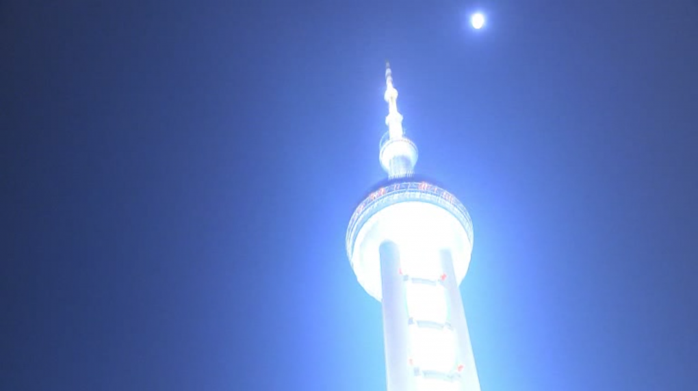
Fig. 2. Cotillard remembers staring at the Oriental Pearl Tower.
There are less obvious links to Lynch’s other work that need mentioning first. The initial flashback shows Cotillard at a lunch meeting as she recollects the preceding day. This flashback is intercut with shots from the present time in the hotel room. During the meeting, she looks out the window and stares at the Oriental Pearl Tower, which is initially just zoomed into, but in the next shot is glowing against the sky (Fig. 2). This functions as a memory trigger (Berra 2012: 243): Cotillard reminisces that the Tower was inspired by a poem about different-sized pearls falling on jade; she heard a sound; she felt that she had been in Shanghai before. Then a shot shows golden pearls bouncing on jade – not unlike the golden pearls that appear in the place of the head of a tulpa being deactivated in Twin Peaks: The Return (Fig. 3). After fragmentary shots portray her memory of the Waibaidu bridge by night and unstably track up some stairs, accompanied by the tango music, the crucial flashback shows Cotillard walking into a room furnished in red with gold patterns and long red curtains, which is shot with an unsteadily moving camera. As Berra notes, this room “recalls such spaces-within-spaces as the ‘Red Room’ in [Twin Peaks] or Club Silencio in Mulholland Drive” (2012: 243). The Red Room (which is crucial to Twin Peaks’ dealing with characters’ spirits) famously consists of long red curtains and a black-and-white chevron floor. Red curtains are also key to the mise-en-scène of Club Silencio. In the room Cotillard enters, a Chinese man appears in the corner by several sets of red curtains and is holding a door, gestures her to stay quiet, closes the door and walks up to kiss her. A sudden noise urges the couple to leave the room through another door and, with blurry camera movements and flashes of lightning, they are shown running through the streets of old Shanghai and over the bridge. Whereas the décor and lighting of the room were predominantly red, the lighting of the streets is tinted blue. This is reminiscent of the extensive use of red and blue in other Lynch films such as Blue Velvet (1986), Mulholland Drive (2001) and Fire Walk With Me – especially in spaces and scenes where pleasure and evil meet.
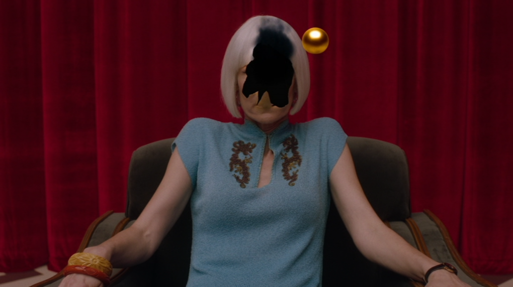
Fig. 3. Diane’s "tulpa" being deactivated in Part 16 of 'Twin Peaks: The Return' (2017).
Although these links may seem to be no more than reminders of other productions by Lynch, they testify not only to a similar visual style, but also to a similar use of mise-en-scène to evoke a sense of mystery or spirituality in dealing with the balance between hedonistic pleasure and inevitable evil. Symbols are employed in a way that defies straightforward meaning-making but rather revels in the sensation evoked by a narrative world in which a character’s pleasure and their dark side are two sides of the same coin. In Fire Walk With Me, red and blue lighting dominates the rave scene in the Roadhouse’s ‘Pink Room’, which is illuminated by strings of red bulbs, red light from holes in the roof, one blue bulb and flickering white-blue lights. This colour scheme, together with the hypnotic, sensuous music, is key to the scene’s atmosphere of indulgent hedonism and the way Laura and Donna are lured into the dark. The red and blue colour scheme in Lady Blue Shanghai, though in the service of a romantic rather than horrific turning point, is equally intense – also notably in the strokes of lighting that linger as the camera swiftly moves past buildings in the cityscape. This pervasive use of red and blue across Lynch’s films encourages viewers to make connections between the texts. Even Cotillard’s nail varnish is red, matched against the blue of her eyes. Whilst this does invite interpretation, what it all means remains vague in all texts – and any explanation feels too simplistic. We can only revel in the imagery by this point.
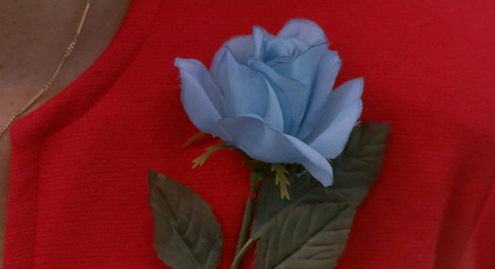
Fig. 4. The blue rose brooch in 'Twin Peaks: Fire Walk With Me' (2002).
Red makes the blue colour of the rose stand out. The blue rose is first portrayed at the start of Fire Walk With Me when David Lynch as Bureau Chief Gordon Cole briefs two Special Agents about the investigation of a murder by presenting them with a dancing woman wearing a red wig and a red dress with a (plastic) blue rose pinned to it as a brooch (Fig. 4). The blue rose is the only symbol not explained by the FBI agents as they drive away. Similarly, the blue Dior bag in Lady Blue Shanghai appears against the background of a red carpet. Cotillard realises that the blue rose is inside when she remembers her encounter with the stranger, with whom she stood on the bridge when he told her that he had to leave her. As they declare love to each other, he unnaturally moves backwards and vanishes into bright light with his hand extended to give her the blue rose. The flashback ends, showing the two men and Cotillard in the hotel room, where she is holding her face in her hands and stares at the handbag; then gets up and approaches it. As she kneels over the handbag, still on its golden altar on the red hotel room carpet, lights flash and the tone of the music changes from euphoric to eerie and to revelatory. As she parts the handles, a bright blue rose emerges, and the camera zooms in. Close-ups show Cotillard looking at the rose, picking it up and bringing it to her nose. She puts it back, closes the handles and clutches the bag with the blue rose close to her chest. It illuminates her as overlaid shots show her emotion, with the men behind her on either side, as the film ends (Fig. 5).
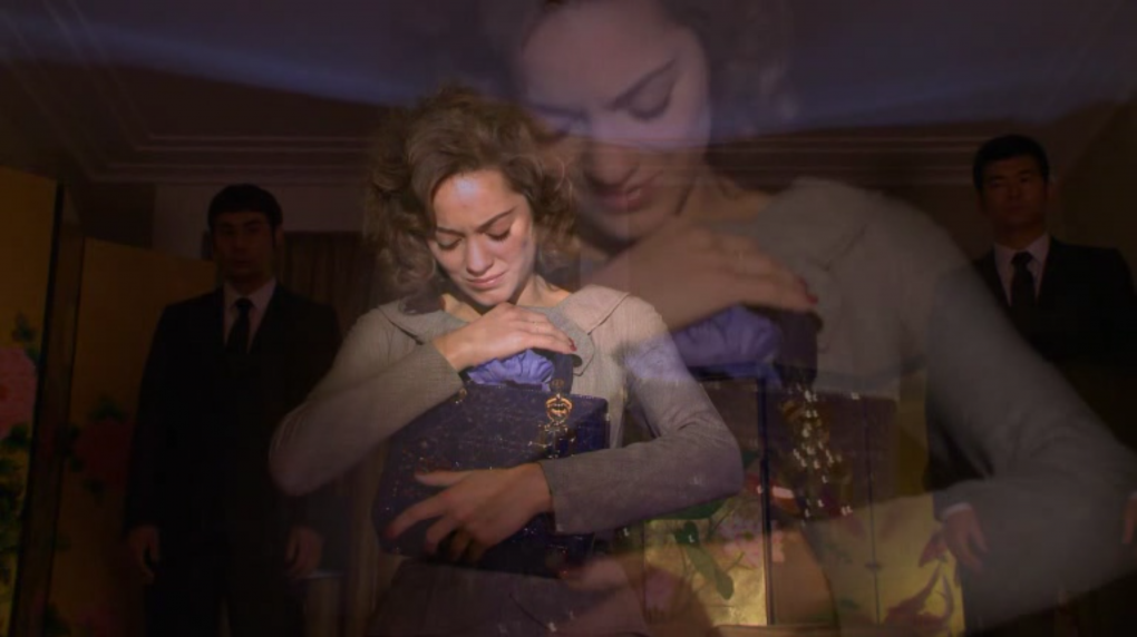
Fig. 5. Cotillard embraces the Lady Dior bag with the blue rose in the final shot of the film.
The significance of the blue rose is only explicated in Part 14 of Twin Peaks: The Return, when Special Agent Albert Rosenfield tells Agent Tammy Preston about the case that prompted the FBI’s Blue Rose Task Force:
Albert: Tammy. Case number one. This started the whole thing. Nineteen seventy-five. Two young field agents investigate a murder in Olympia, Washington. They arrive at a motel to arrest a suspect named Lois Duffy. They hear a gunshot outside her room and kick the door in. They find two women inside, one on the floor dying from a bullet wound to the abdomen. The other holds a gun, which she drops as she backs away when they enter. They recognize the wounded woman as Lois Duffy. She speaks her last words to them: “I’m like the blue rose.” She smiles, then dies… then disappears before their eyes. The other woman screaming in the corner, they now notice is also Lois Duffy.
Tammy: Hmm.
Albert: By the way, Lois Duffy did not have a twin sister. Then while awaiting trial for a murder she swore she didn’t commit, this Lois hangs herself. Those two arresting officers were Gordon Cole and Phillip Jeffries. Now, what’s the one question you should ask me?
Tammy: What’s the significance of the blue rose?
Albert: And the answer?
Tammy: Hmm. Blue rose does not occur in nature. It’s not a natural thing. The dying woman was not natural. Conjured. What’s the word? A tulpa.
Albert: Good.
The blue rose in the Twin Peaks universe thus stands for cases that defy rational explanation and the source of which lies in spirituality. At the same time, there is a task force instated to investigate these cases. This represents the type of viewing that characterises Lynch’s texts: although viewers want to make sense of the narrative riddle by trying to interpret the images, often the figures, objects and colours of the image remain stubbornly in place as strange and surreal. To some scenes, the best viewing attitude is what I fondly refer to as the ‘Lynch shrug’: to shrug and just roll along; to simply enjoy the sensation or experience evoked.
Looking back at Lady Blue Shanghai after The Return, one could interpret that Cotillard’s Shanghai lover is a tulpa. Holding a blue rose in his hand, he vanishes as suddenly from the bridge as he appeared in the red room – and tulpas are (de)activated in the Red Room of Twin Peaks. The Dior bag that appears to Cotillard in her hotel room contains only the blue rose, which is implied to stand in for her lover. If this man is like a blue rose, he is a tulpa. Perhaps, however, this is over-reading the text; forcing an interpretation. The blue rose is a symbol that refuses logical interpretation – it is the visual equivalent of the ‘Lynch shrug’. In Twin Peaks and in Lady Blue Shanghai, the balance between sense-making and shrugging relies on the tone of the scene. The tone and style of this fashion film—with its artificial juxtaposition of blue and red, its unsteadily moving camera creating blurry images, its use of contrasting music, and its conflicting cultural and stylistic references—complicate speculation until all we can do is shrug at the symbols’ meaning. If the blue rose has a meaning, it is a command to not (over)think but to accept the mystery or spirituality. Tone here eclipses the analytical mode of viewing.
Costumes, objects and stylistic references
Since others have dealt with the question of whether Lady Blue Shanghai is more of a David Lynch short film or a Dior fashion commercial (Berra 2012; Berry 2013; BRICK&MORTAR 2017), I will bench this issue in favour of a look at the workings of tone and mise-en-scène. As I have argued elsewhere 4, short-form films tend to get lost in the gap between film and other media studies, and as such receive marginal critical attention. Scholarship on style and aesthetics is limited where it comes to the short film. Costuming, amongst other aspects, does however work differently according to the duration and structure of the material – costume design for serial television requires different strategies than for a one-off feature film. Marion Cotillard in Lady Blue Shanghai wears two different costumes for the complete film; the other characters only one. In contrast to Lynch’s other film and television productions, there is no costume designer credited for this work. This leaves us with the assumption that the costumes, like the handbag, are Dior products. But does that make them less artistically valuable?
Whilst I disagree with Berry (2013) that Lady Blue Shanghai represents any desire to obscure its commercial goal and only to an extent agree with Berra (2012) that the film represents a successful convergence between the Lynch trademark and the Dior brand, I would like to offer a third reading that exposes the potential of the film to be critical of its commercial and artistic value. Berry complains that the spectacular appearance of the handbag is
a rather tawdry device [which] acts as a parody of Lynch’s previous work and so his oeuvre is cast as a commodity in the same mode as the Dior handbag. The branded product becomes a central character that undergoes a transformation from a source of anxiety to a fetish object that replaces Cotillard’s love interest. (2013: 2)
As mentioned above, close attention to tone suggests that Lynch takes symbols neither in his own work nor in the world of fashion seriously and is fully aware of their commodity value. I would further propose that the Dior bag functions more like a costume object than a character. Specifically, it is what Stella Bruzzi (1997) has termed a ‘spectacular costume’, which, rather than absorbing narrative meaning, imposes on the scenes in which it appears. Such costumes “can function independently of the body, character and narrative, [and] through them alternative discursive strategies can be evolved that, in turn, question existing assumptions about the relationship between spectator and image” (Bruzzi 1997: 3). Spectacular fashion can, as Stella Bruzzi and Pamela Church Gibson (2004) have argued for Sex and the City, become a ‘character’, but the Dior bag remains stubbornly in view as an object onto which Cotillard’s character projects her memories and feelings. The identity of the handbag remains mysterious; the ‘transformation’ Berry speaks of takes place only within the character of Cotillard. If it is a character, it is not a protagonist. Rather, it is an object displayed with a tone that carries an underlying critique of the very nature of consumption and commodity fetishism from within.
Similar to Lynch’s other advertising, the product is displayed with an exaggerated intensity that undermines a genuine tone. When Cotillard and the Shanghai stranger are on the bridge together and he repeats how beautiful it all is, the unsteadily held camera halts its movement to show a digital billboard across the canal on which Cotillard is shown holding the handbag. During the rest of the film she wears a grey skirted two-piece with a tied shawl collar, slim black waist belt and black buttons on the jacket, but on this billboard she is wearing a glossy black V-neck long-sleeved dress and has her hair tied back rather than loose. She dances to her left and right, holding the Dior bag up in the air; then the billboard image freezes and the bag pops from the screen, leaving its frozen image on the board behind (Fig. 6). The handbag floats through the air surrounded by a slight haze and comes closer to the viewer. The scene swiftly cuts back to the couple, who simply agree that all is beautiful and are not disturbed by this. Again: are we supposed to take this seriously? The intense music accompanying the states of mind of Cotillard’s character is more dramatic than it needs to be; the product is shown with more intensity than it needs to be. As Linda Hutcheon points out, “[i]rony isn’t irony until it is interpreted as such” (1994: 6), but I would argue that there is enough reason given by the tone of the filmic material to invite an ironic interpretation of the text. Just like the spontaneous romance between the characters proves too good to be true (as he vanishes as swiftly as he appeared), it is implied that so is the idea that buying the magically glowing handbag will actually fulfil the consumer.
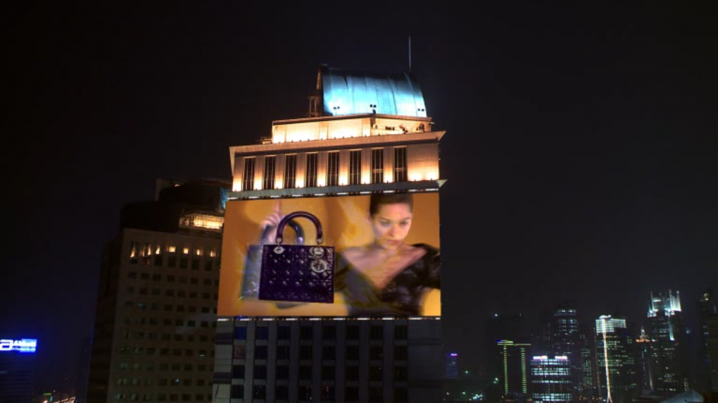
Fig. 6. The Lady Dior bag pops out from a billboard screen in Cotillard’s flashback.
The costumes, sets, lighting and props in the film carry an abundance of cultural signifiers and stylistic references. Whereas Cotillard’s grey skirt suit with the tied shawl collar has a vintage Parisian 1950s style, the tango music and the objects and patterns in the settings are markers of 1920s/1930s Argentine Orientalism (see Civantos 2006). Is this a comment on Dior’s choice of location? Berra explains:
The location of Shanghai was insisted on to coincide with the reopening of the Dior store in Shanghai at Plaza 66, West Nanjing Road. This also coincided with the World Expo and the 2011 Dior fashion show that was held in Shanghai on 15 May (Zinderman 2010). However, the location choice of Shanghai also has much to do with the city’s bid to re-establish itself as the ‘Paris of the East’. (2012: 238)
Yet, Cotillard (a Parisienne herself) is portrayed as a stranger; fascinated but out of place, and from her viewpoint the film deals with its surroundings in an abstracted way. This is a contrast to the Parisian glamour of Dior advertisements such as the ‘J’Adore’ perfume commercials, in which Charlize Theron confidently strides through gold-coloured spaces (and that this is Paris is undeniable: the first one from 2010 ends on a shot of the Dior store by night with the Eiffel Tower in the background). There are further intertextual references to Chinese independent art cinema through a similar use of contrasting colours, decorations, claustrophobic spaces, unusual pacing and atmosphere as in Wong Kar-Wai films such as In the Mood for Love (2000) and 2046 (2004). Perhaps this is a comment on Dior’s choice for an American rather than a Chinese filmmaker to shoot a film in Shanghai. The film does not make a hierarchical distinction between any of these references; the links to Lynch’s own work merge with other stylistic markers from art cinema and fashion advertising, which makes it difficult to interpret any one of them. Lorenzo Baldassari on Twitter even notes a similarity between Lady Blue Shanghai and Kiss Me Deadly (1955). Not all potential references are as identifiable: the two Shanghai men (with unspecified jobs) who are called to Cotillard’s hotel room wear black suits with white shirts and black ties, which is similar to the costumes of the FBI agents in Twin Peaks – but men in black can still mean any number of things. Overall, these references make the film into a potpourri of signs with an ironic attitude towards its commercial-but-artistic goal.
Conclusion
The murky symbolism of the blue rose, which encourages yet defies interpretation, connects Lady Blue Shanghai to the more widely acknowledged Twin Peaks universe in David Lynch’s oeuvre and invites the viewer to read the texts in a similar way. Like Twin Peaks, this film exploits its own merging of art, commerce and popular culture. Twin Peaks is exceptionally self-aware in the way it deals with—and disrupts—expectations: it is both a genuine murder mystery with an original visual style and an excessive expansion of that category. It both uses the melodramatic conventions of soap opera and satirises them. This is most clear in the show-within-a-show Invitation to Love, the ridiculously excessive soap opera that the characters are hooked on which mitigates and makes self-aware the drama of the show itself. Lady Blue Shanghai exemplifies a similar attitude to the category of the fashion film to which it belongs. Twin Peaks, and especially The Return, also presents a narrative riddle but demands a viewing mode in which we often have to shrug and simply accept the surreal – and it is fully aware of this. In Part 4 of The Return, long before the blue rose (or the tulpa) is explained, Albert, Tammy and Gordon meet the tulpa of Dale Cooper (Kyle MacLachlan) in prison. The scene that follows has an intense blue colour filter, and as Albert and Gordon discuss this Blue Rose case, Gordon Cole, played by David Lynch himself, confirms: “It doesn’t get any bluer.”
Ultimately, David Lynch’s directorial style is used as a justification for Lady Blue Shanghai’s ridiculing of the act of having an artistic filmmaker advertise a fashion object. This may be a cynical reading of the film, but my point is that its tone is critical of the commercial-but-artistic nature of its own function as a fashion film. The film toys with audience expectations of meaning-making in advertising; it offers a deceptive sense of familiarity with a type of media that we know how to make sense of, but its exaggerated, ironic attitude towards the material turns these expectations onto themselves. Both critics and the brands themselves seem to buy into the idea that the artistic value of Lynch’s work is meant to overshadow its commercialism, but Lynch does not take this seriously, and neither should we. The tone of the film conveys the sense of mystery/spirituality that Lynch’s work is famous for and mocks the type of advertising it engages in. The moments when the Dior bag appears in a spectacular cloud of haze and later pops out from the billboard are similar to the product placements in his other work: embedded in a ‘Lynchian’ style and narrative but so tongue-in-cheek that it betrays the brand’s strategy. Even if it sells, we are not genuinely encouraged by Lynch to buy it.
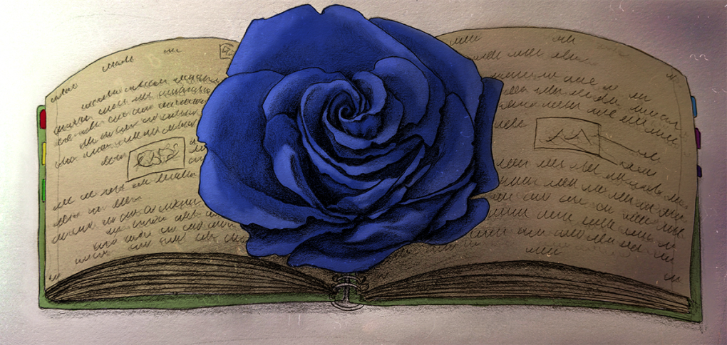
Inspired by this article, writer/illustrator James Alex Davies shows the Blue Rose Case as opened.
Notes
1. In the narrative of Twin Peaks: The Return, a tulpa is a duplicate individual made by the evil entity Judy in the Black Lodge.
2. This is a popular term that may not stand up to critical scrutiny, but as Berra explains, it is “being used to describe any film, television series or music video that combines a sinister edge with vaguely discernible meaning, or strikes a ‘balance between the macabre and the mundane’ (Urban Dictionary 2004)” (2012: 235).
3. It is interesting here that James Marshall, who plays in the Hemingway advertisement, and Heather Graham, who is being kissed in the Fitzgerald one, later went on to star in Twin Peaks (Goldwin 2017).
4. See my 2017 article ‘The Bitter Seriality of Don Hertzfeldt’s It’s Such A Beautiful Day’ for the Animation Studies 2.0 blog: https://blog.animationstudies.org/?p=2148.
References
Berra, John (2012), “Lady Blue Shanghai: The strange case of David Lynch and Dior”. In: Film, Fashion & Consumption, vol. 1, no. 3.
Berry, Jess (2013), “Unfolding Fashion's Fictions: Fashion Film and the Narrative Possibilities of Dress”. In: Catwalk: The Journal of Fashion, Beauty and Style, vol. 2, no. 1.
BRICK&MORTAR (2017), “David Lynch and the genre of Fashion Film”. In: BRICK&MORTAR Fashion Photography & Styling (blog), retrieved from: http://www.bybrickandmortar.com/blog/2015/3/16/david-lynch-and-the-genre-of-fashion-film.
Bruzzi, Stella (1997), Undressing Cinema: Clothing and Identity in the Movies. London and New York: Routledge.
Bruzzi, Stella & Pamela Church Gibson (2004), “”Fashion is the Fifth Character”: Fashion, Costume and Character in Sex and the City”. In: Kim Akass & Janet McCabe (eds). Reading Sex and the City. London and New York: I.B. Tauris, 115-129.
Civantos, Christina (2006), Between Argentines and Arabs: Argentine Orientalism, Arab Immigrants, and the Writing of Identity. New York: State University of New York Press.
Godwin, Jack (2017), “David Lynch’s TV commercials are even weirder than his films”. In: Little White Lies, retrieved from: https://lwlies.com/articles/david-lynch-tv-commercials/.
Hutcheon, Linda (1994), Irony’s Edge: The Theory and Politics of Irony. New York: Routledge.
Mijovic, Nikola (2013), “Narrative form and the rhetoric of fashion in the promotional fashion film”. In: Film, Fashion & Consumption, vol. 2, no. 2.
Pye, Douglas (2007), ‘Movies and Tone’. In: Close-Up 02. London: Wallflower Press.
Radner, Hillary (2011), Neo-Feminist Cinema: Girly Films, Chick Flicks and Consumer Culture. New York: Routledge.
Todd, Anthony (2012), Authorship and the Films of David Lynch: aesthetic receptions in contemporary Hollywood. London and New York: I.B. Tauris.
Suggested citation
Wolthuis, Josette (2019), A Blue Rose Case: David Lynch’s Lady Blue Shanghai for Dior. Kosmorama #274 (www.kosmorama.org).